Project Statement
In this assignment, my classmates and I were each assigned a different letterpress printer or shop then asked to create an informative booklet about the printer/shop in a way that honors its style. Creating these booklets would expand our knowledge of prominent figures in the letterpress printing community. I was assigned the Globe Collection and Press. Globe is a press located in the Maryland Institute College of Art, and they are known for their neon colors, bold designs, and a rich history serving performers and musicians.
Target Audience
I knew I’d eventually share my booklet to Behance and to my professional Instagram account, and since Globe is a well-known press, anyone researching Globe could happen across my booklet. For that reason, I could expect my audience to largely consist of other designers and friends of Globe.
Research
The first part of my research involved online investigation including Globe’s website and Globe’s official Instagram account. From there, I gathered an assortment of fonts and colors used prominently in their branding, plenty of examples of their work, and a feel for their visual aesthetic.

My visual research board
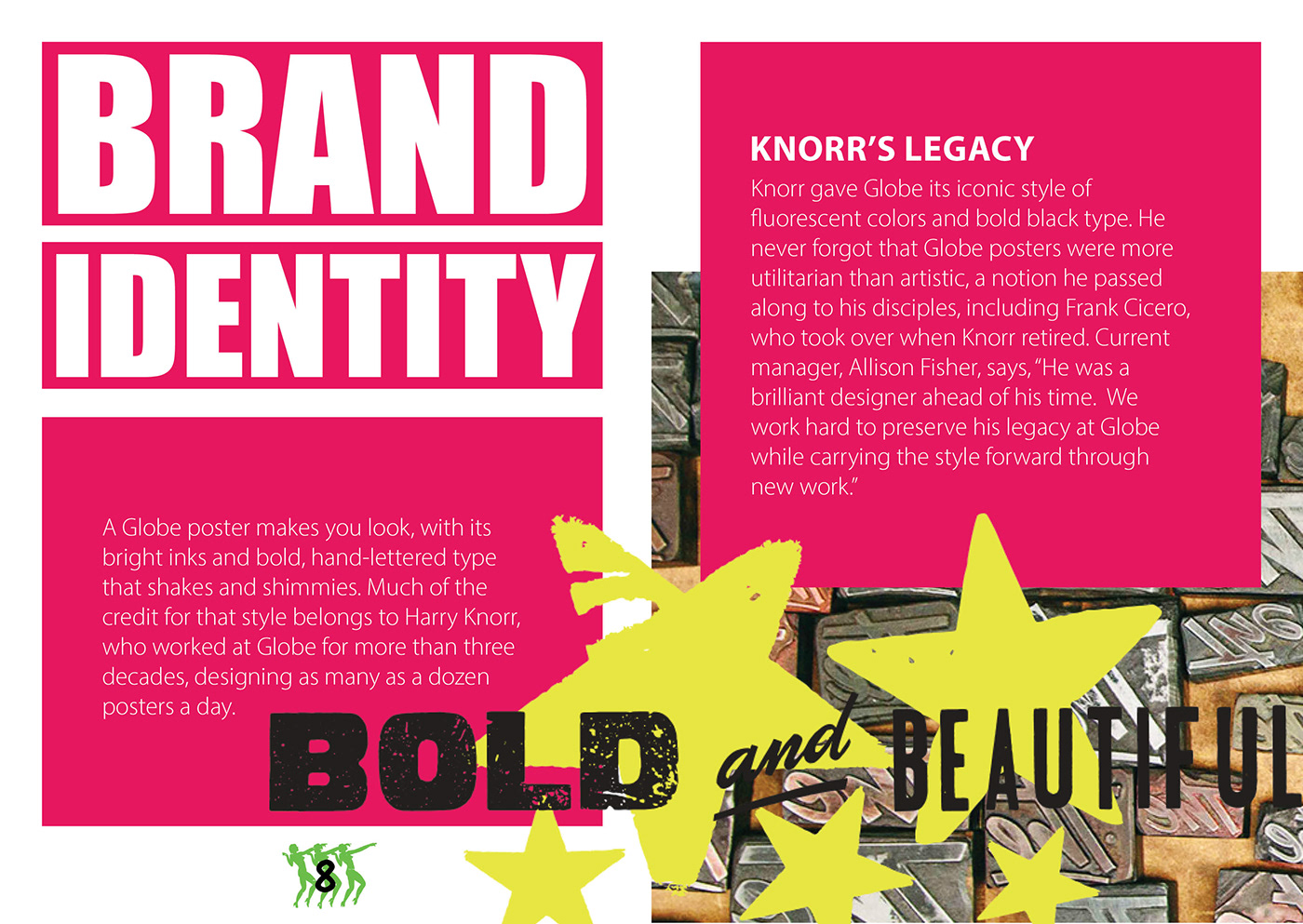
The second part of my research involved emailing with Allison Fisher, the manager of Globe. I asked her a few questions about Globe’s recurring events, relation to student life, philosophy, and plans for the future. Her responses provided me with quotes and facts to use in my booklet and also helped me determine which aspects of Globe’s business I should highlight, such as Harry Knorr’s legacy and Globe’s pro-vote campaign.
Design Process
My booklet design was heavily influenced by Globe’s posters. Throughout my design education, I have been learning the value of simplicity. However, with Globe’s bold style, the line between successful imitation and superfluous decoration became more blurred. I had to stay conscious of this fine line during this project so that I could honor Globe’s grandiose aesthetic while keeping my design elegant.
In my initial sketches, I used four different fonts of varying sizes throughout my body paragraphs. I chose this unconventional style to resemble the chaotic nature of Globe’s posters. In later iterations, I modeled the design off of the body paragraphs on Globe’s web page, with just one font on a block of color with thick margins. This decision shifted the emphasis away from the body paragraphs and onto the posters, allowing the posters to speak for themselves.

An early version of pages 4 and 5, with lots of different fonts and point sizes in a single body paragraph
Design Solution
This project greatly expanded my knowledge of the Globe Collection and Press, and I’m happy with the way I conveyed a lot of visual information while keeping my designs simple enough to be read comfortably.
However, the booklet still has a few issues with consistency. My use of Globe’s wood type on the front cover and Impact everywhere else adds an unnecessary layer of complexity. If I have the chance to spend more time on this in the future, I hope to eliminate Impact entirely and construct each heading out of Globe’s wood type. I’d also add more hand-printed forms. The only hand-printed forms I used outside of the title were the green stars on page 5, and incorporating similar hand-printed elements throughout the booklet would make it much more cohesive.
I could nitpick my work for paragraphs on end, but overall, my booklet concisely imparts comprehensive knowledge about Globe and immerses the reader in Globe’s visual aesthetic.